one pixel at a time.
My name is Ross, your partner in design.
UX/UI
Marketing
Coffee
Friends of Free Wildlife
Friends of Free Wildlife is a team project focused on breathing life into the NPO's brand by designing a responsive website and strategizing the '#WatchItFly' campaign, linking users to a bird and its rehabilitation to foster emotion and connectivity.
Vision Corner
The Vision Corner Smart System is a curation of technologies designed to work coherently with each other, connected by a singular dashboard that the workforce can control the system from.
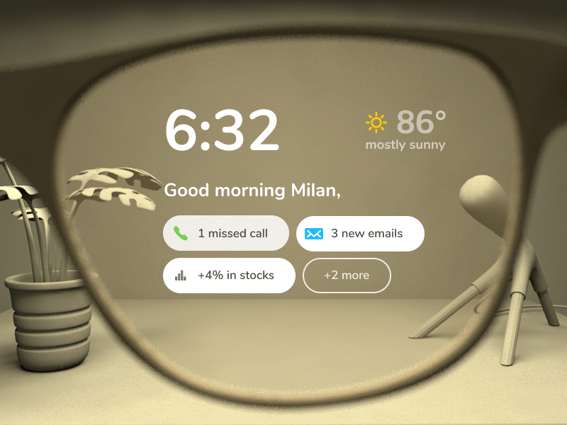
Insight
Insight is an app centered around accessibility for monocular-vision impaired individuals. The app works alongside augmented reality smart glasses to make the user's life easier, more enjoyable and by immersing their world
Tradepiece
Tradepiece is a watch market app for luxury watch dealers. With a touch of gamification, users are able to sell, buy, and rate watches while building a community amongst each other
let's talk
Got a project in mind?
Let's go on a business date and create something special.
Email
[email protected]
Phone
+27 79 758 8050
Friends of Free Wildlife is a team project focused on breathing life into the NPO's brand by designing a responsive website and strategizing
the #WatchItFly campaign, linking users to a bird and its rehabilitation to foster emotion and connectivity.
My Role
Lead Visual Designer
Wireframing, Prototyping, UI design
Overview
The mission is to venture into an unfamiliar and new environment by creating a human-centered design solution covered in compassion. Creating a compact integrated campaign to promote a digital solution that is meant to increase digital engagement and attract those who can make difference in the lives of free wildlife.
Welcome to a comprehensive overview of the complete design solution for Friends of Free Wildlife, a project aimed at creating a positive impact on wildlife conservation.When you dive in, you will uncover a world of creativity covered in compassionOur collaborative efforts have been dedicated to ideate and create a design for a Campaign as well as a re-design for the responsive website.We are excited to share the journey with you.
who are the methods behind the madness?
Meet the team
How it began
A visit to the facility had taken place, where the team would take part in the volunteer work whilst simultaneously doing vigorous research on what happens at the heart of the organization. It then became clear what the nature loving organization had to improve on.
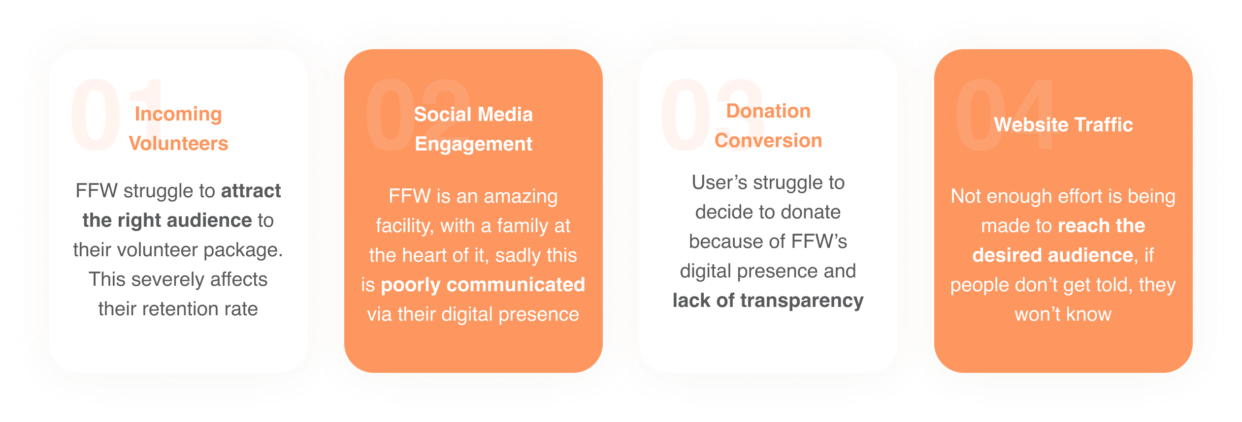
The issue
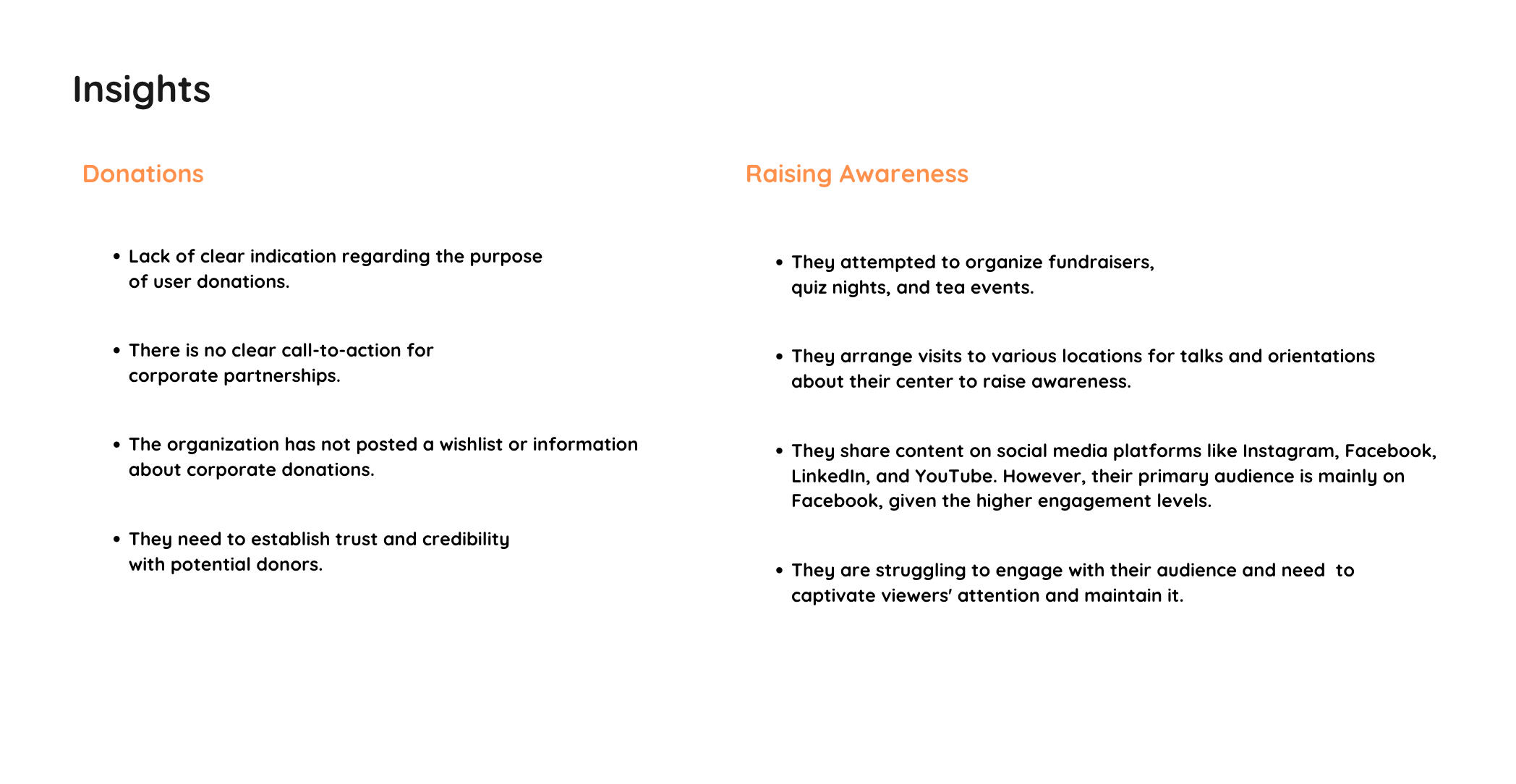
Friends of Free wildlife need to create transparency as a means to increase awareness and engagement with their Wishlist, ensuring a greater understanding of the organization's needs and fostering community support.
this raised the question
"How might we utilize transparency to bring awareness to the Friends of Free Wildlife Wishlist"?
The ideal audience
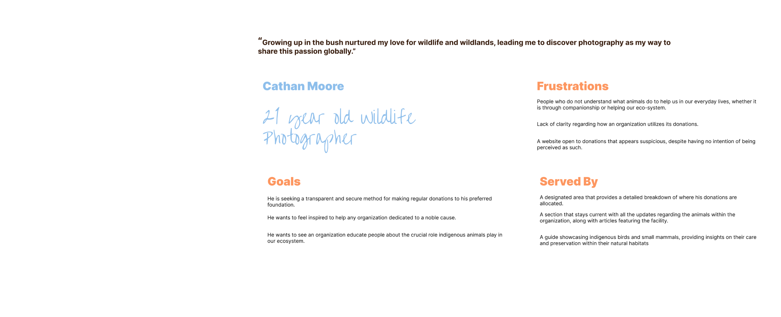
Cathan Moore
Creating a persona is vital for visualizing the key audience as it transforms abstract data into a relatable, humanized representation. Cathan embodies the audience's needs, behaviors, and preferences, providing crucial insights for designing an engaging and resonant user experience. By tailoring design elements to this persona, we are able to empathize with the audience, align communication strategies effectively, and make informed decisions. The persona serves as a guide, ensuring the final product is not only visually appealing but also deeply connected to the real people it intends to serve, fostering a user-centric approach throughout the design process.
We did a lot of digging
Developing a solution strategy and Key Performance Indicators (KPIs) is essential for organizational problem-solving. It provides a clear roadmap for addressing issues, offering measurable objectives to track progress. KPIs serve as benchmarks, enabling the organization to assess the effectiveness of implemented solutions, ensuring continuous improvement and strategic alignment with FFW's goals.
Content Inventory and layout
Digital concept
Digital wireframes are crucial in implementing the solution as they provide a visual blueprint for the website's structure and functionality. They help streamline design decisions, ensuring alignment with the envisioned solution. Digital wireframes facilitate collaboration, allowing stakeholders to preview and refine the interface before development, saving time and resources in the implementation process.
the visual execution
The websites visual direction
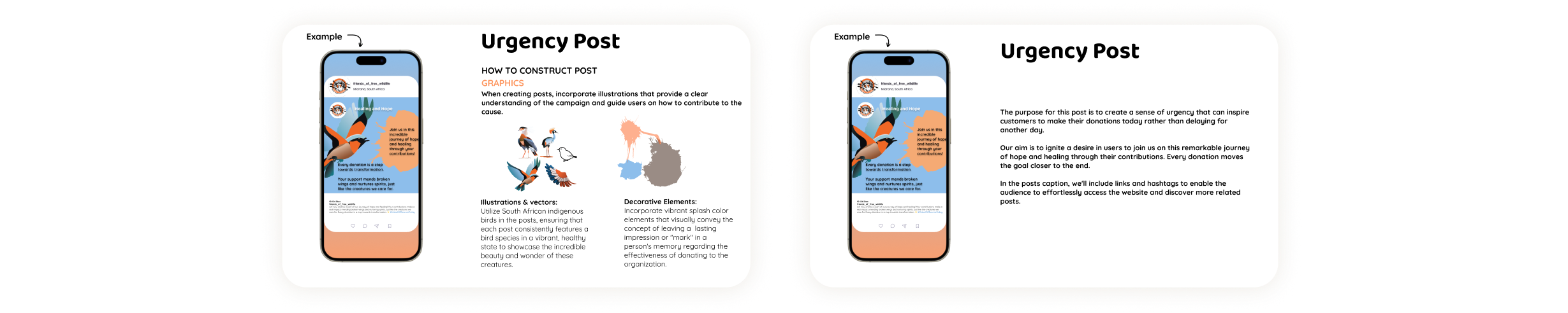
The website's visual direction should convey transparency and emotion, aligning with Friends of Free Wildlife's mission. A cohesive design, incorporating elements like splash and stroke illustrations, communicates the journey of bird recovery. This visual strategy fosters trust, engages users in the cause, and efficiently addresses the organization's resource awareness challenges.
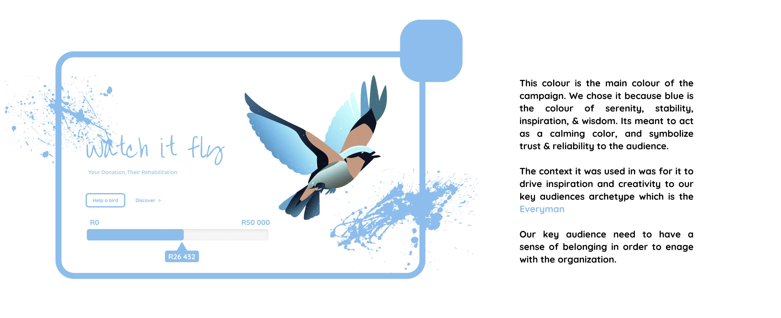
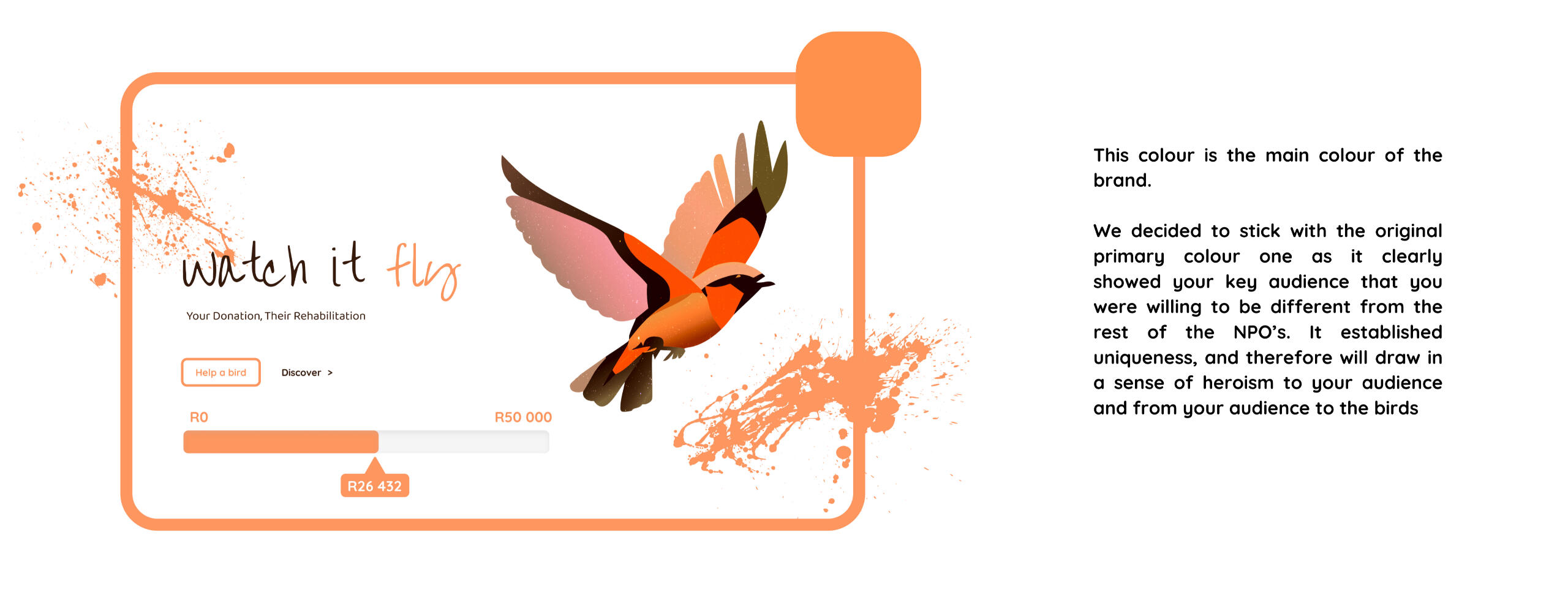
The progress bar is a powerful visual tool that serves two essential purposes in boosting audience engagement and conversions. Firstly, it provides transparency by displaying the amount of money received from the public. This transparency is critical for building trust, as it assures potential donors that their contributions will be used effectively.Secondly, the progress bar acts as a motivational element. It conveys a sense of collective effort and urgency, encouraging the target audience to participate and be a part of the ongoing success. By making the donation process transparent and dynamic, it drives conversions by tapping into the audience's desire to be part of a growing and impactful movement.
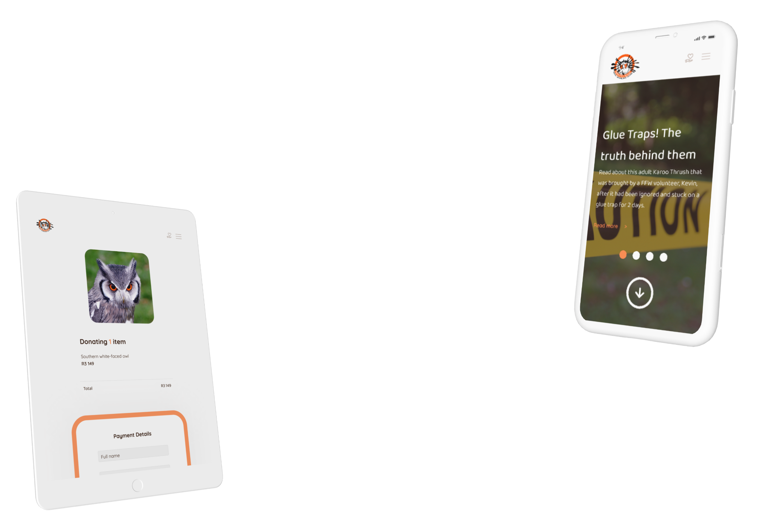
Responsiveness is vital because it directly impacts the user experience and engagement on the Friends of Free Wildlife website. As the goal is to increase awareness about their resource needs and involve the audience in bird recovery efforts, a responsive design ensures that visitors can access and interact with the website seamlessly on various devices, including mobile phones and tablets.This accessibility fosters user engagement, making it easy for potential supporters and volunteers to explore the bird recovery journey, understand the organization's needs, and take action. A responsive design enhances the overall user experience, increasing the chances of achieving the website's objectives effectively.
The Friends of Free Wildlife website links the user's donation directly to a bird's rehabilitation journey, fostering an emotional connection and a sense of personal involvement. By allowing users to select a bird and fulfill its wishlist, the website ensures transparency and trust, demonstrating how their support directly impacts the birds. The coherent visual theme, featuring splash and stroke illustrations, visually reinforces this journey of recovery. Users are encouraged to be an integral part of the bird's journey, understanding that the bird's flight to recovery depends on their help. The website effectively communicates this message and encourages users to engage, donate, and play an active role in the organization's mission.
an interactive prototype
Representation of the Friends of Free Wild Life Website
A prototype of the website is instrumental in solving Friends of Free Wildlife's problems by providing a tangible, interactive representation of the envisioned digital solution. It allows stakeholders to test functionalities, assess user experience, and refine design elements, ensuring the final product effectively addresses resource awareness and engages the target audience.
visual direction
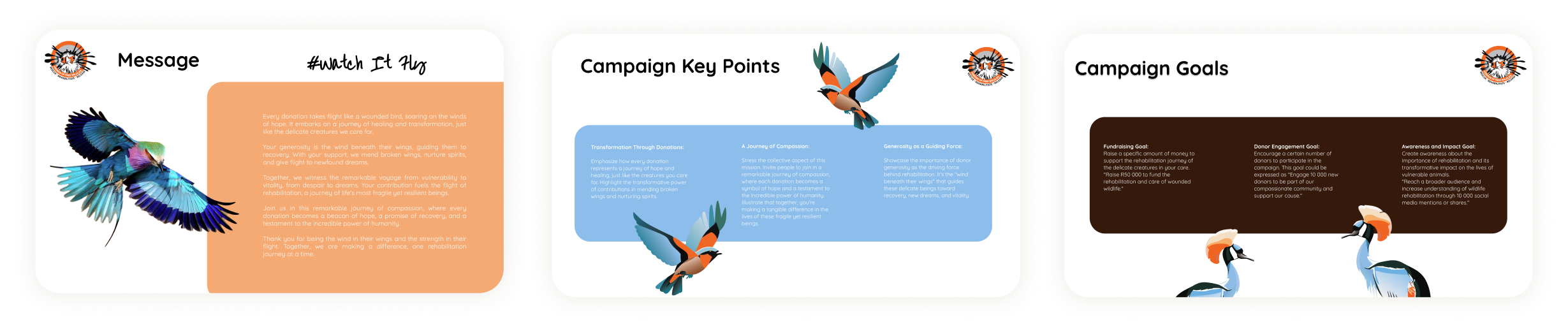
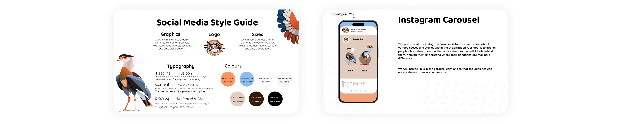
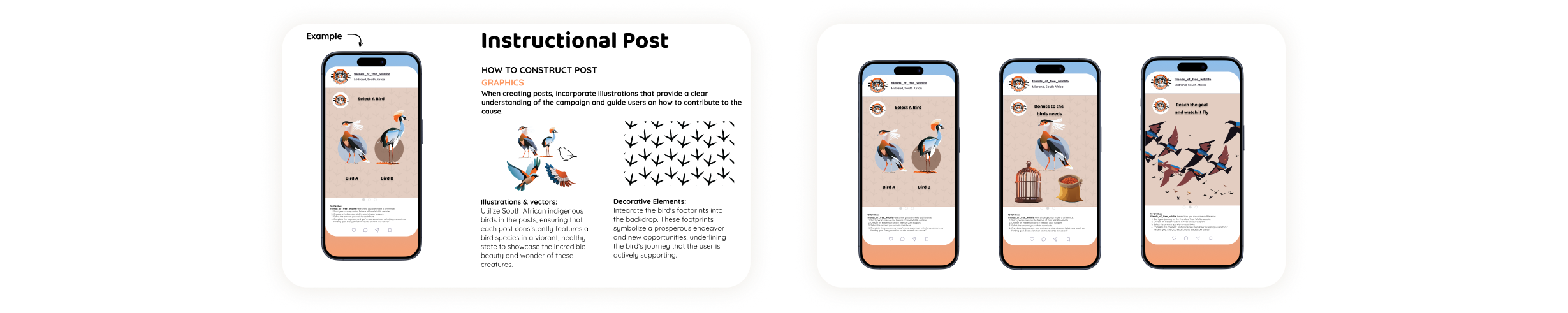
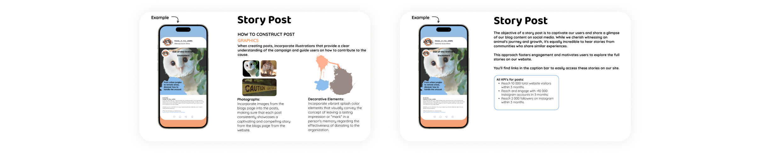
Social Media Package
The social media package enables FFW to reach a targeted audience, which will help them improve their online retention rate, and drive more traffic by using these tools and strategies.
what's next?
epilogue
This project hinged on the principles of responsive interface design and the effectiveness of collaborative efforts among our team of designers. The experience of researching a real-life organization proved to be a highlight of our journey, offering invaluable insights into genuine needs and potential solutions.Perhaps most importantly, this project served as a valuable lesson in communication, collaboration, and compromise. The skills acquired through this endeavor are not only pivotal to the success of our team but also hold significant promise for the growth and success of each individual designer in their future projects.
The Vision Corner Smart System is a curation of technologies designed to work coherently with each other, connected by a singular dashboard that the workforce can control the system from.
My Role
Sole UX Designer
Information architecture, Prototyping,
UI design, Tech curation, UX Research
Design Challenge
Developing a smart technology system that enhances Vision Corner’s operations and improves efficiency. Curating a suitable smart technology solution that aligns with the business's needs and objectives, and then designing the system to create a smarter and more connected environment.
What is Vision Corner?
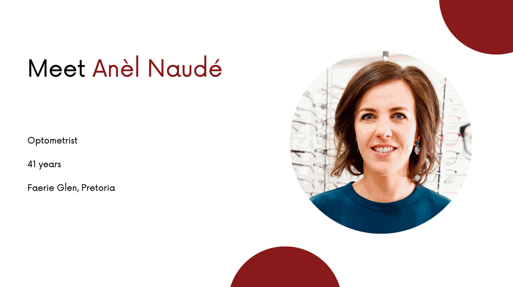
Vision Corner is an optometry practice where optometrists examine, diagnose, and provide treatment for visual issues and eye-related conditions, as well as prescribe corrective lenses to improve vision.
Problem
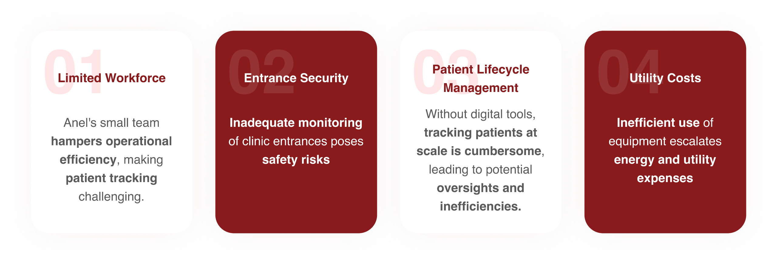
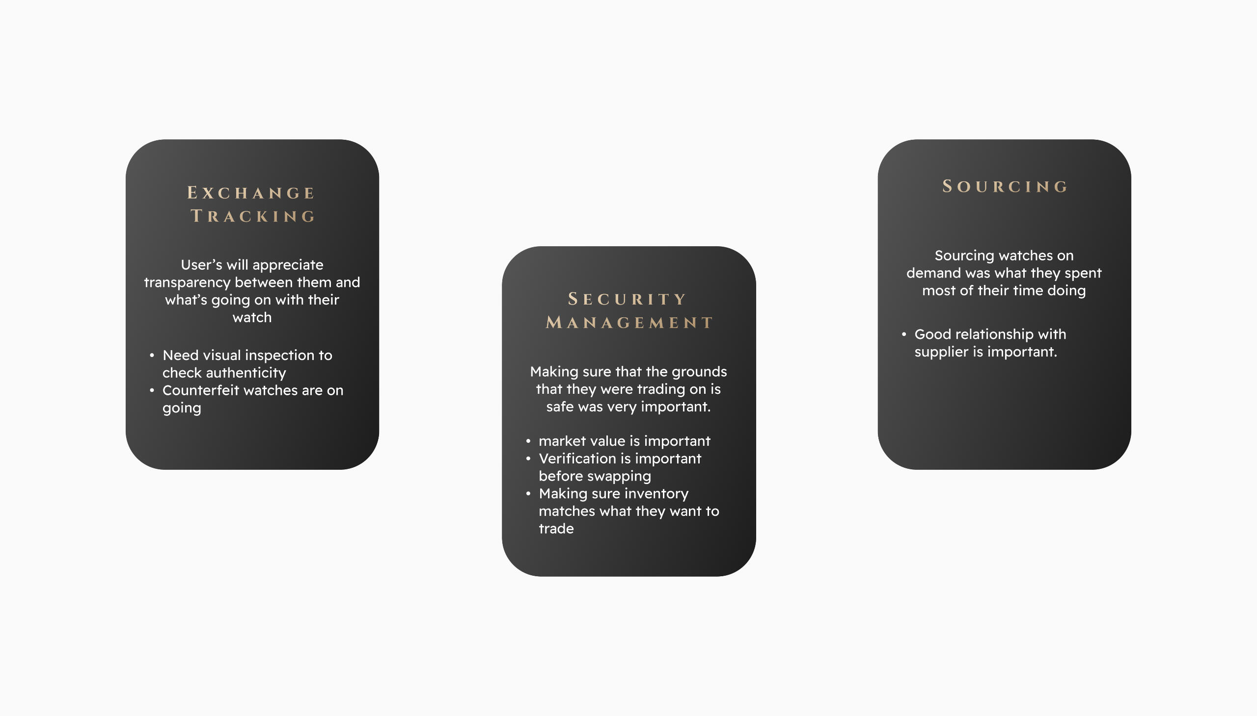
Anel is an optometrist that has a small team and so efficiency and safety is a problem in their everyday life. because they are so few, tracking a clients life cycle at scale is difficult and servicing them takes enegy and utility costs
Solution
A curation of technologies that focus’s on alerting the business on the entrances activity, a digital system that can track their current patient and a dashboard that allows the to control their equipment.
who are we designing for?
so it begs the question
"How might we help Anèl and her small team work more safely & efficiently?"
Let's launch our ideation
The journey began by collecting crucial information about the space in which the smart system will be integrated. This was achieved by visiting the space, putting together desktop mindmaps, and conducting client interviews.
how does the space look like?
Spacial Analysis
Visiting the clinic is pivotal for spatial analysis as it provides firsthand insights into the physical layout. Examining the space allows precise placement of entrance activity sensors and patient tracking devices, ensuring the technology integrates seamlessly with the clinic's operations, enhancing efficiency, and addressing Anel's specific challenges.
Client Research
Anel and her team at Vision Corner were interviewed to help shed some light on potential pain points, as well as which aspects of the project need the most attention when the technology curation begins.
what were the main problems?
Key Insights
The user journey
A visual storyboard is essential for conveying the envisioned solution effectively. It captures the evolution of Anel's clinic from current challenges to the implementation of the smart system, providing a tangible narrative. This visual representation aids in conceptualizing the interconnected technologies and their seamless integration, fostering a clear understanding.
digital wireframes
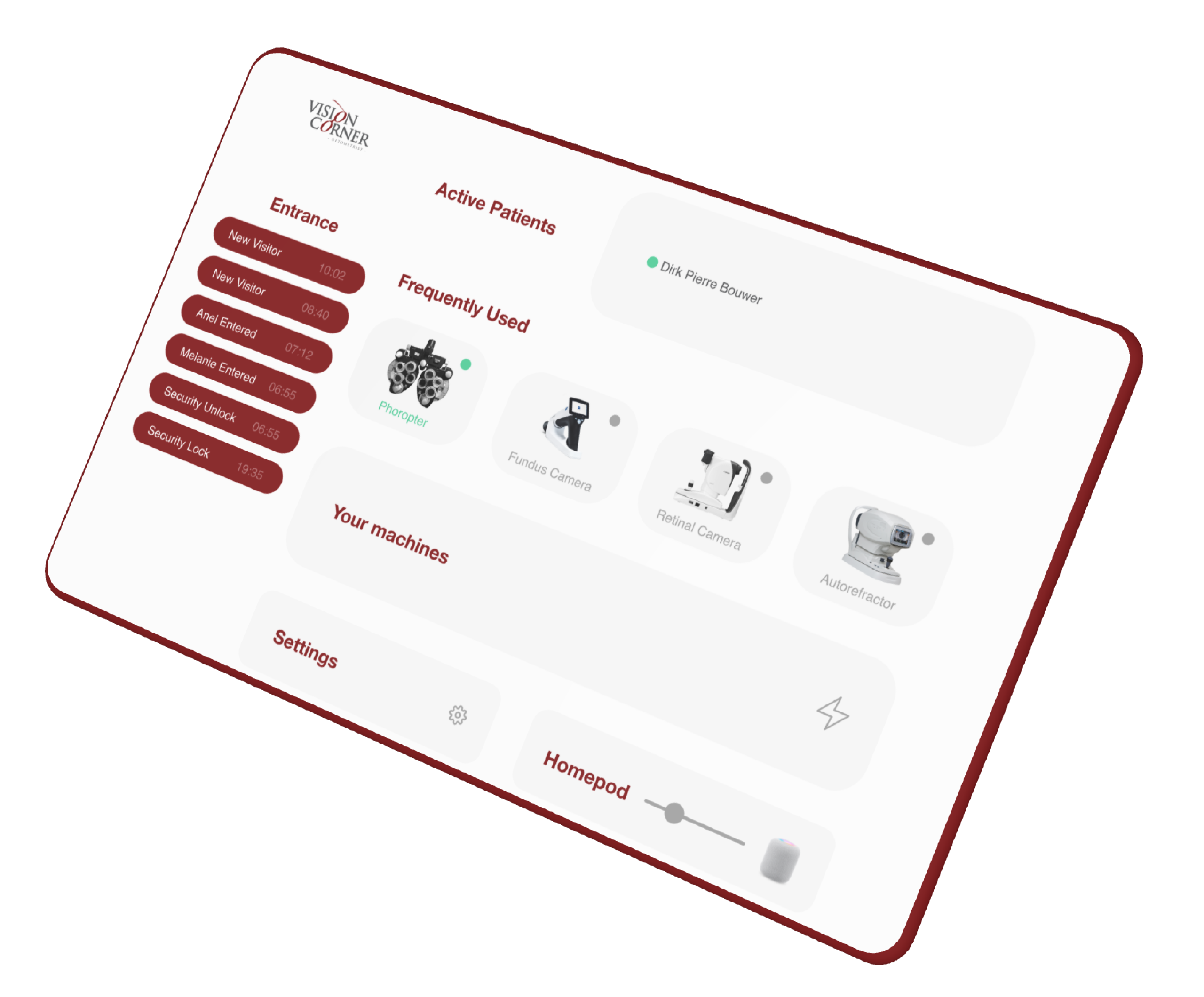
The dashboard
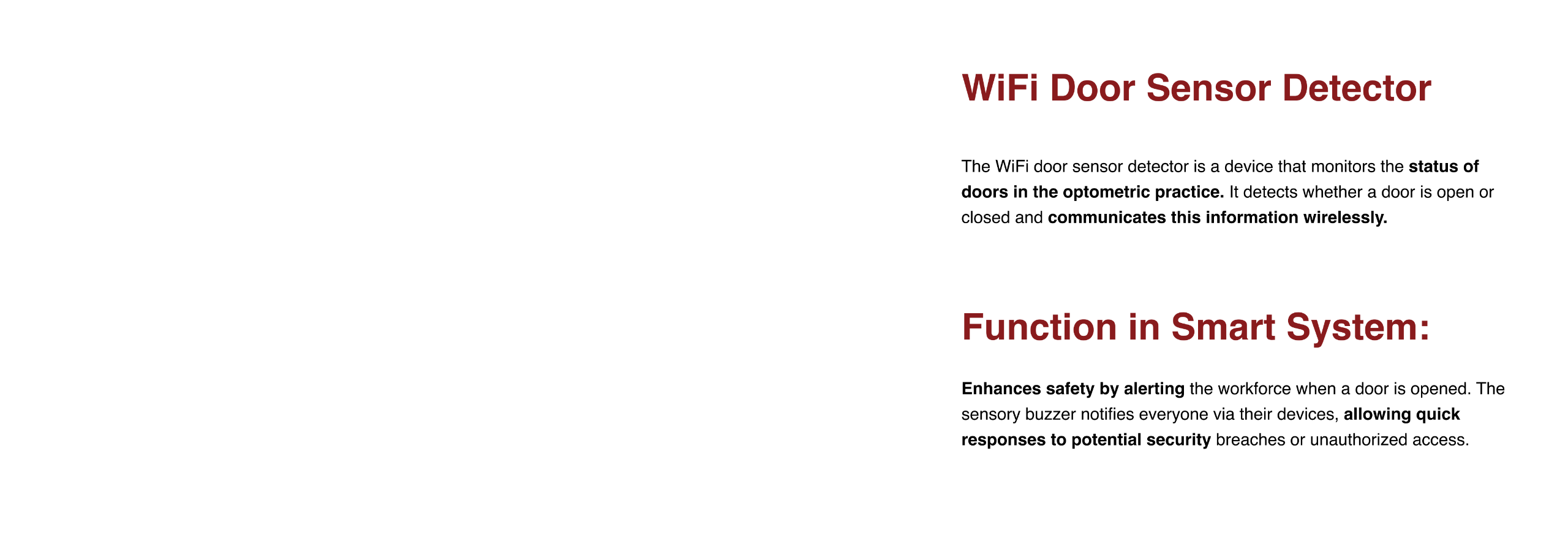
The dashboard serves as the central nerve of the Vision Corner Smart System, empowering Anel to control and monitor operations seamlessly. It enables real-time oversight of entrance activities, patient tracking, and equipment usage. By consolidating information, Anel gains efficiency, enhances safety, and reduces utility costs, addressing key challenges in their small clinic.
the final execution
Vision Corner Smart System
Using all the information gathered, a final curation of all the technology for the smart space was made, with the aim to enhance security through spatial analysis and activity alerts. A centralized dashboard was implemented to optimize control, minimizing costs while maximizing productivity.
Smart Space Wireframe
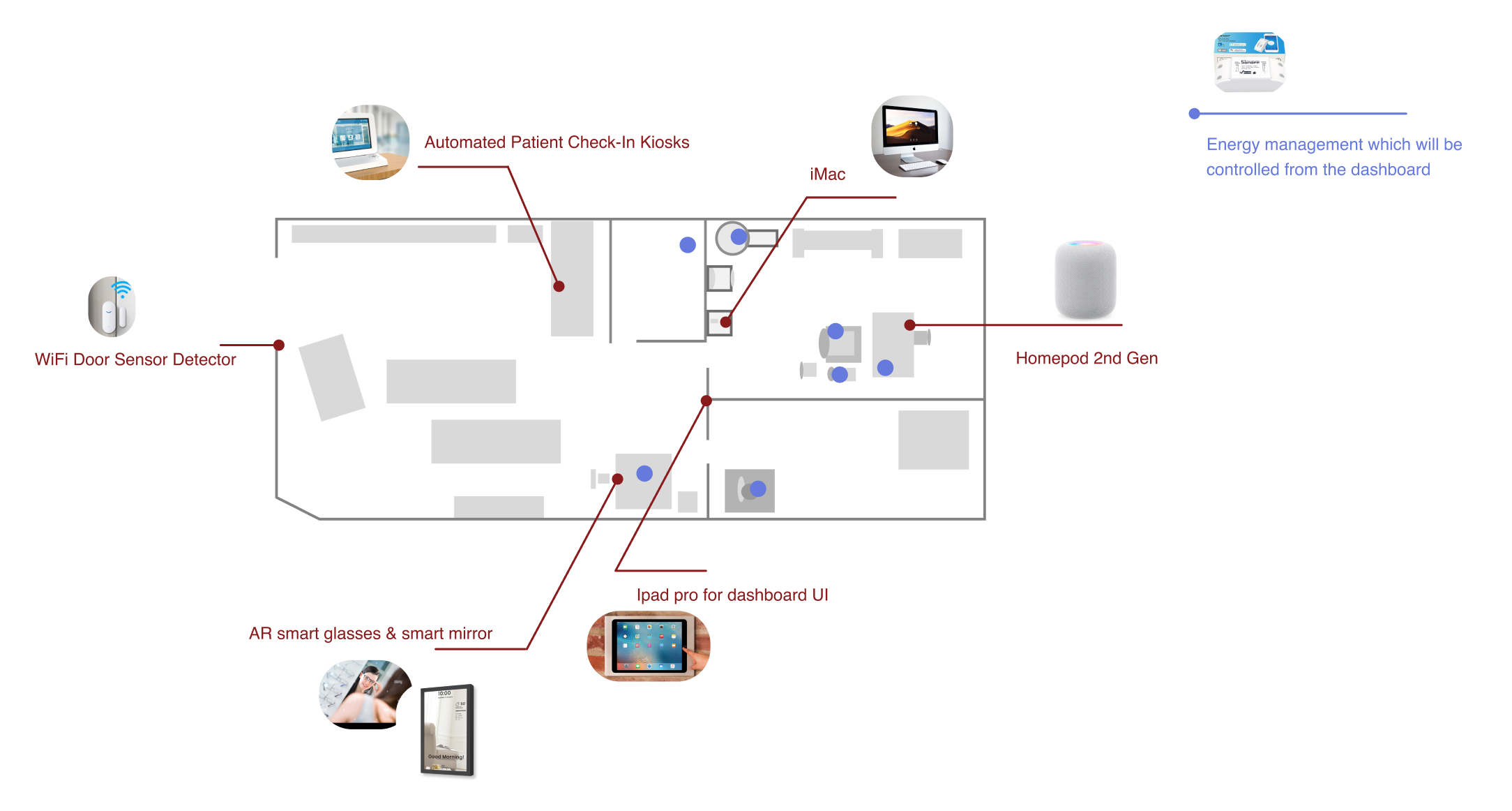
A smart space wireframe is vital to strategically plan the placement of technology within Anel's clinic. It visually maps the location of entrance sensors, patient tracking devices, and control dashboard, ensuring an optimized and efficient spatial arrangement. This visualization aids in seamless integration, maximizing the system's impact on operations.
the technology the makes up the smart system
Tech Breakdown
the final solution of the smart solution and how it would be implemented
Smart System Walkthrough
what's next?
epilogue
At the end of this project, Interaction and User experience design is an art that goes far beyond just user interfaces, as developing a smart system using a curation of technologies cemented all the core principles found in UX design which involve, but not limited to, putting the user first, and creating an easy & coherent experience.The next step for this project is begin some user testing and having the system built out in order to highlight the benefits and refine the rest.
Insight is an app centered around accessibility for monocular-vision impaired individuals. The app works alongside augmented reality smart glasses to make the user's life easier, more enjoyable and by immersing their world
My Role
Sole UX Designer
Information architecture, prototyping, UI design
Content strategy, UX Research
Design challenge
Creating a native app that enhances a user with monocular vision. Making them independent and minimizing the pain points they experience in their everyday lives. The challenge involves envisioning a "day in the life" of the user with a disability, understanding their barriers and challenges, and conducting research on their disabilities, current devices, and available technology.
Problem statement
Franco's visual impairment affects his ability of perception, often missing things around him. Activities that require prolonged visual attention, such as reading, are also challenging as they result in eye strain, which can cause discomfort in his neck, as well as headaches.
Solution
A spatial awareness app that helps Franco understand his surroundings when it comes to objects, areas, and text
who are we designing for?
Meet Franco
after considering the key issues, a question arised.
"How might we help Franco be more independent in interacting with his daily tasks using adaptable technology?"
what kind of emotions would he feel when using this app?
Franco's emotional journey
Monocular vision refers to only having useful vision in one eye which can either be complete or partial; partial referring to having some remaining vision in the affected eye, while complete meaning absolute blindness in the one eye (Cityeye 2021).
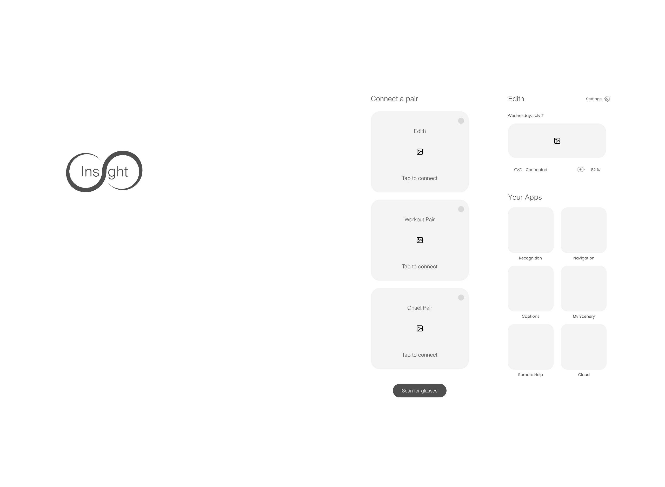
he's wearable technology
Franco's augmented reality glasses
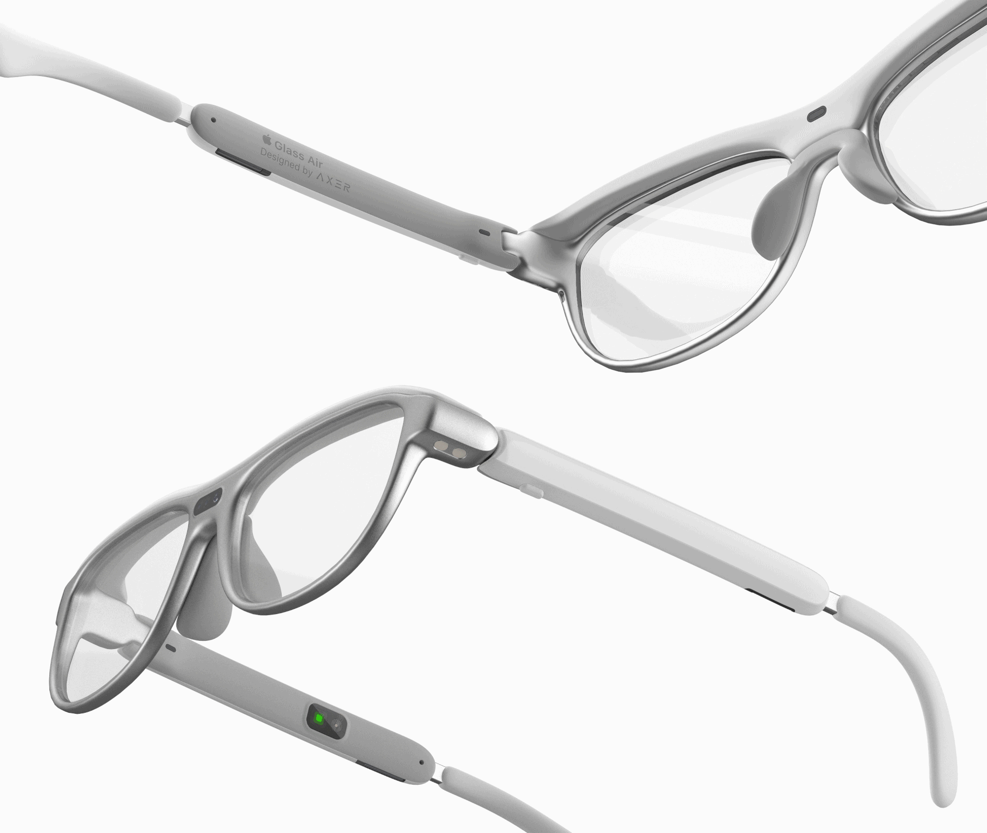
AR glasses will take in Franco’s surroundings and feed the Insight app all the data about his surroundings and the objects he interacts with so that Franco will not have to strain his eyes in order to navigate and recognize people and his surroundings
what can the app do?
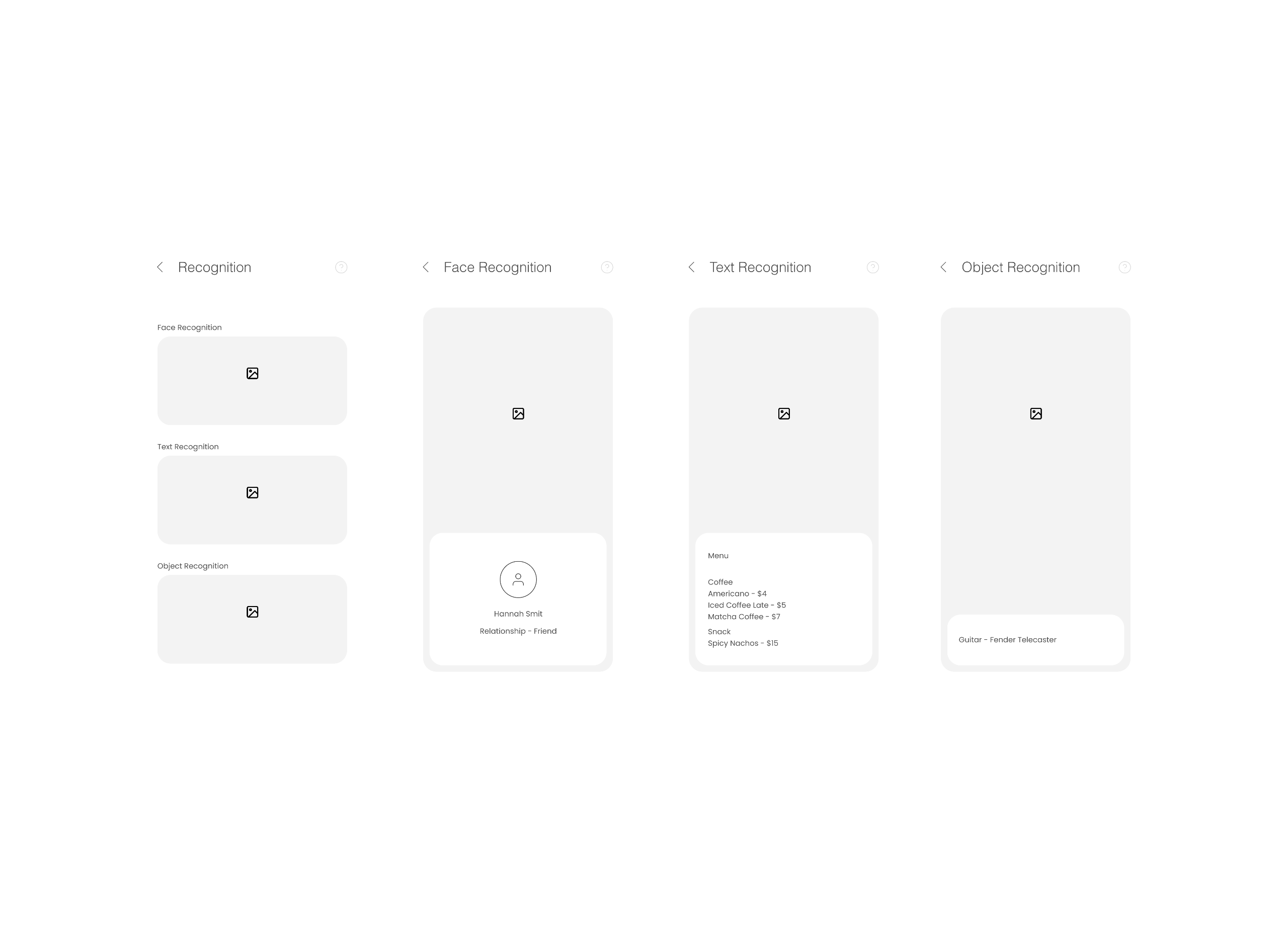
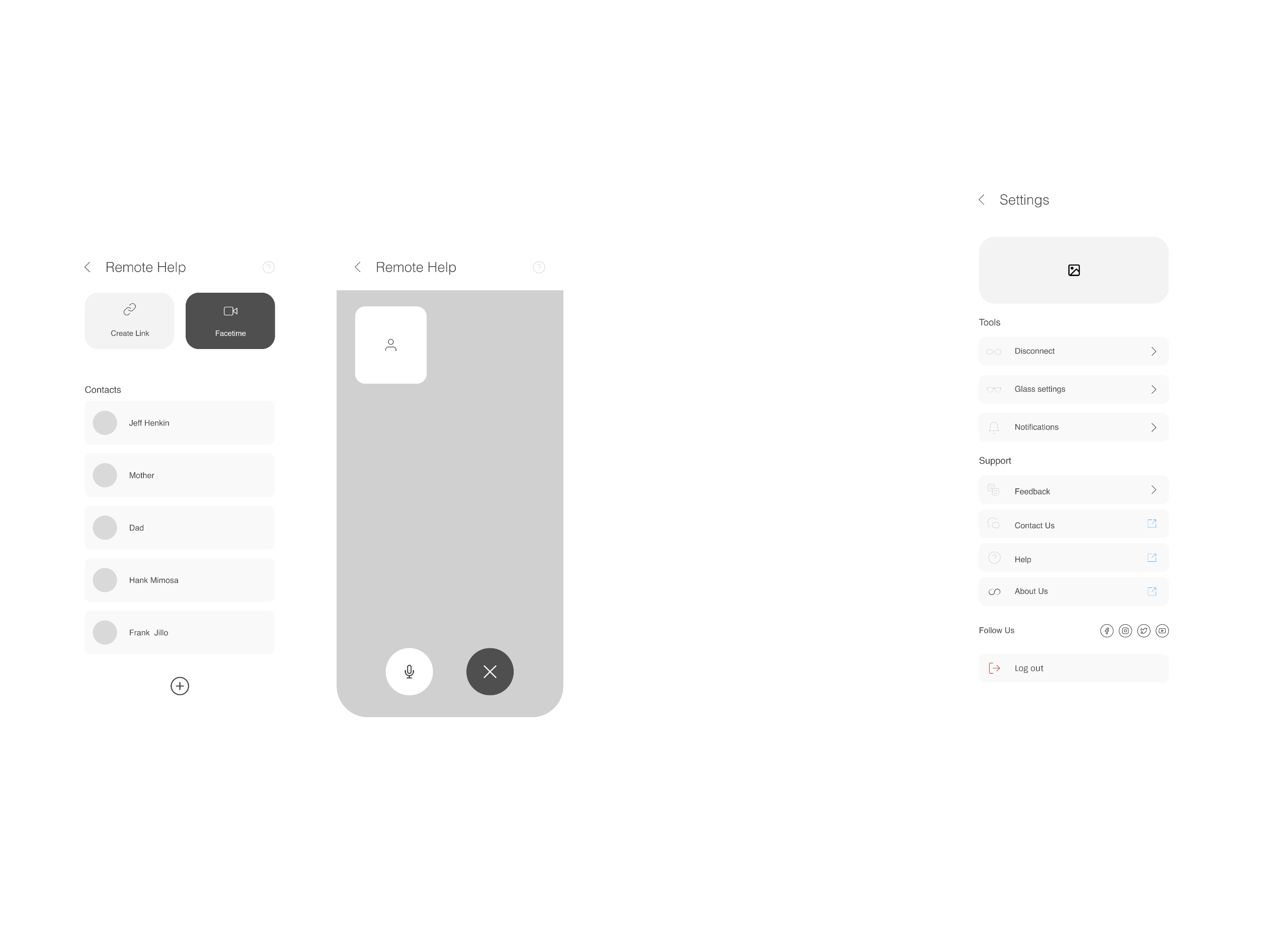
Insight's features & functions
putting the app together so that it can go through some valid user testing
high fidelity wireframes

what are the guidelines needed to build a similar app?
Accessibility & UI Guide
final execution
interactive prototype
Let's put all of that research and user testing to work.
point your camera at me to have a closer look at the app
what's next?
epilogue
Understanding the different ways to include different kinds of individuals using design and applying accessibility parameters has proven to be a very important aspect of building a scalable app that is useful to everyone.The next step to improve its experience would be to conduct some usability tests and identify a proof of concept that would aid the app and its brand to really connect with the user emotionally.
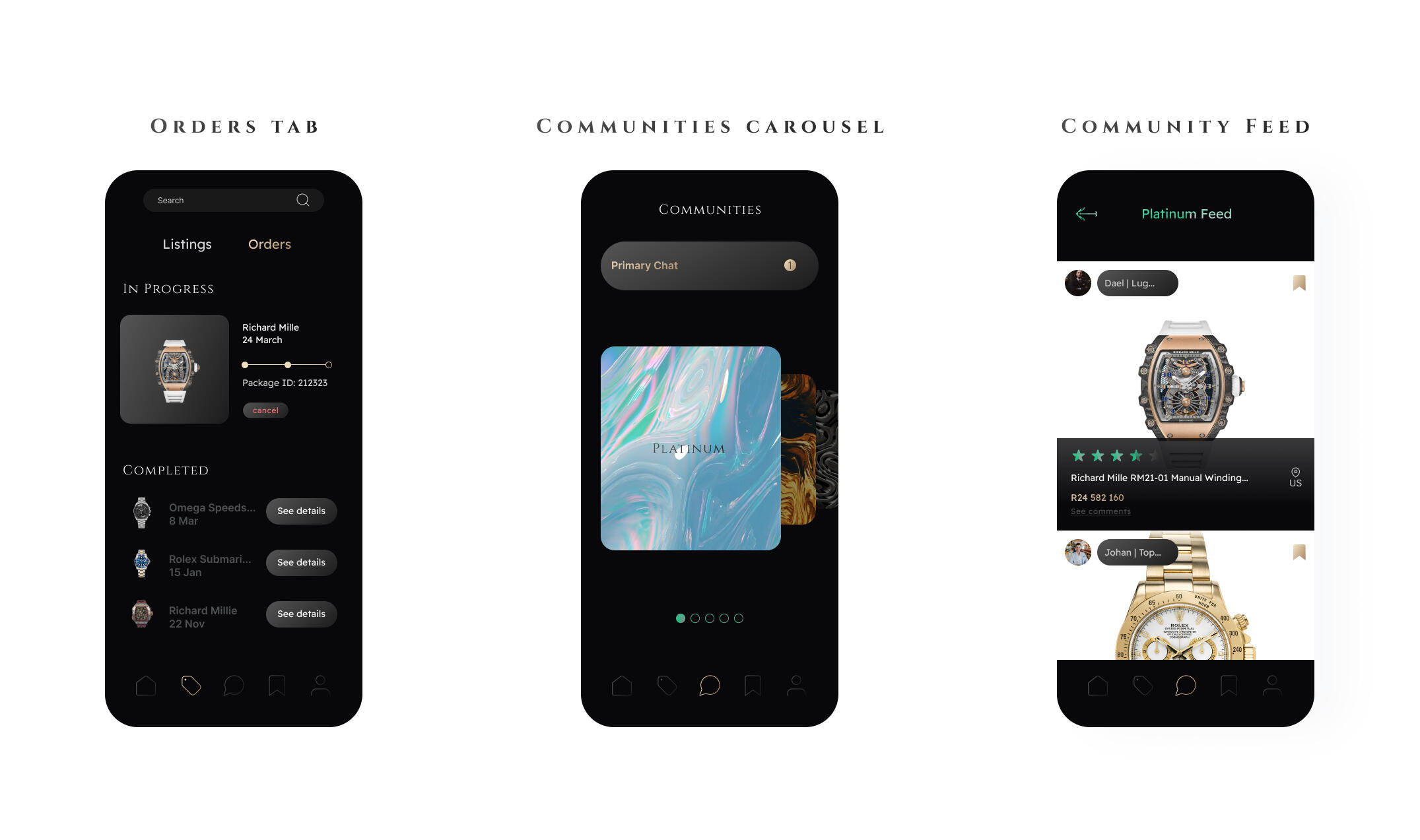
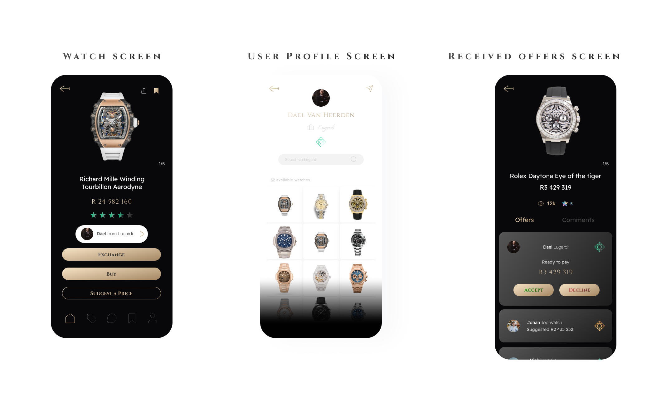
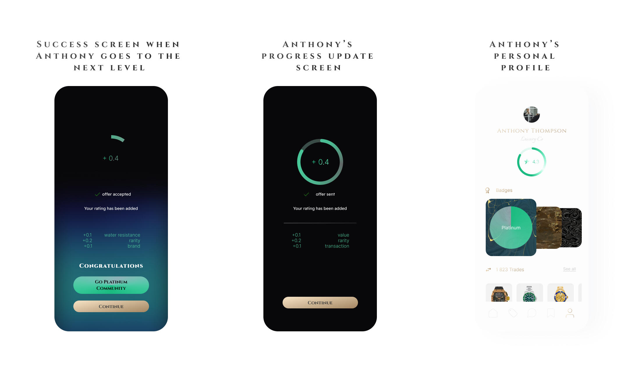
Tradepiece is an app made to assist luxury watch dealers in trading expensive timepieces securely and in a trusted environment using the art of gamification.
My Role
Sole UX Designer
Information architecture, prototyping, UI design
Content strategy, UX Research
Design challenge
The challenge was to design a digital solution to help luxury watch resellers source watches quicker and safely. This project responded to a specific design challenge where a design thinking process was followed to create a high-fidelity proof of concept called Tradepiece
Problem statement
Luxury watch dealers biggest problem is sourcing high quality watches in a short period of time
Solution
A marketplace that allows luxury watch dealers to connect and trade amongst themselves.
who are we designing for?
The first step in designing a user experience is figuring out our ideal user archetype, and having the design decisions based on a them
Meet Anthony
the question that took form is
"How might we help watch resellers in sourcing watches safely and securely?"
what kind of emotions would he feel when using this app?
the emotional map
extracted the most important information from the user research conducted on many users similar to Anthony
key insights
how would we get the user's to keep a high retention within the app?
a gamification breakdown
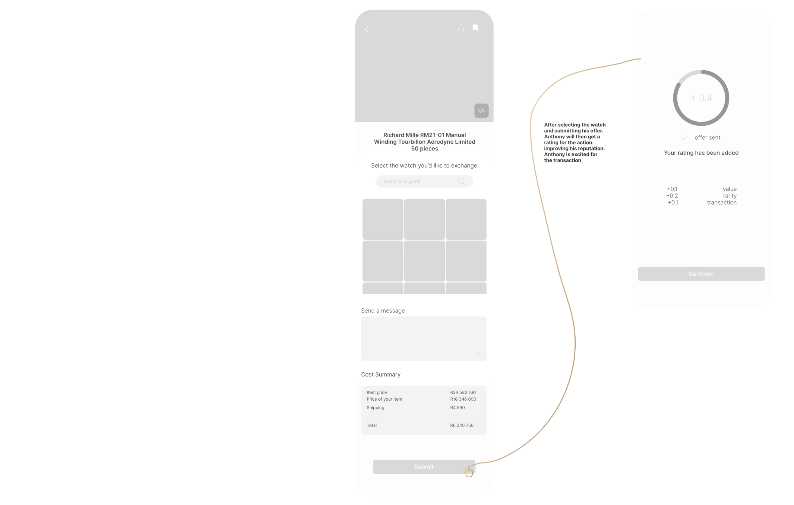
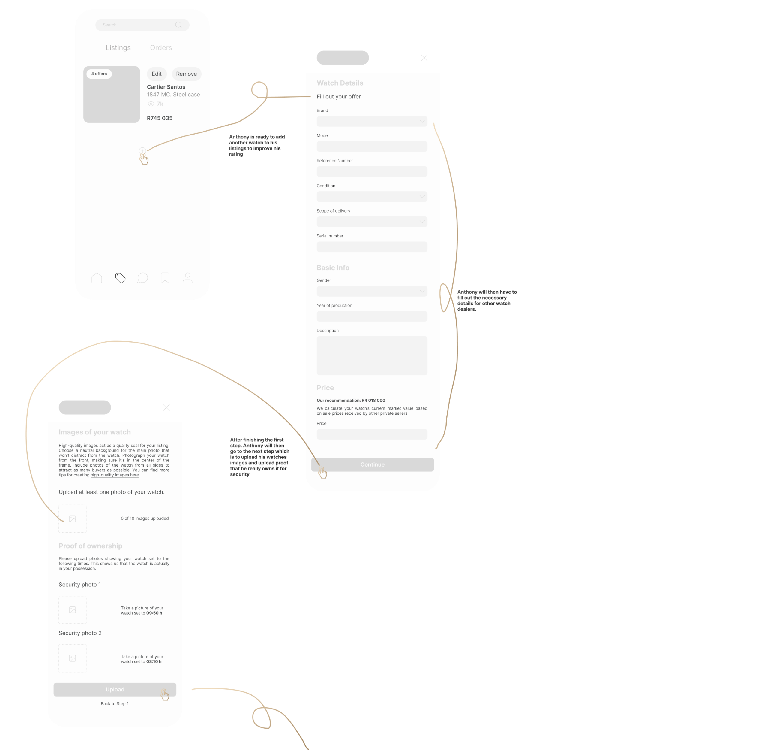
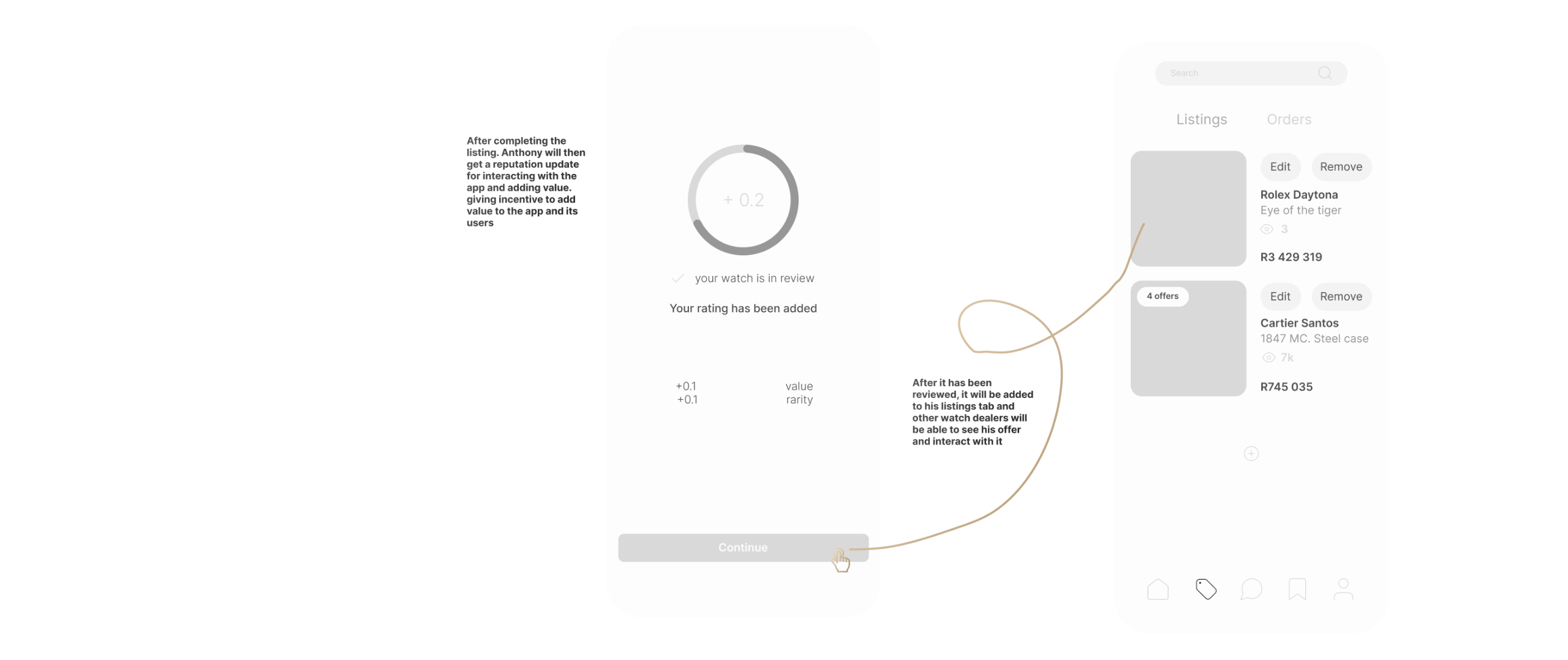
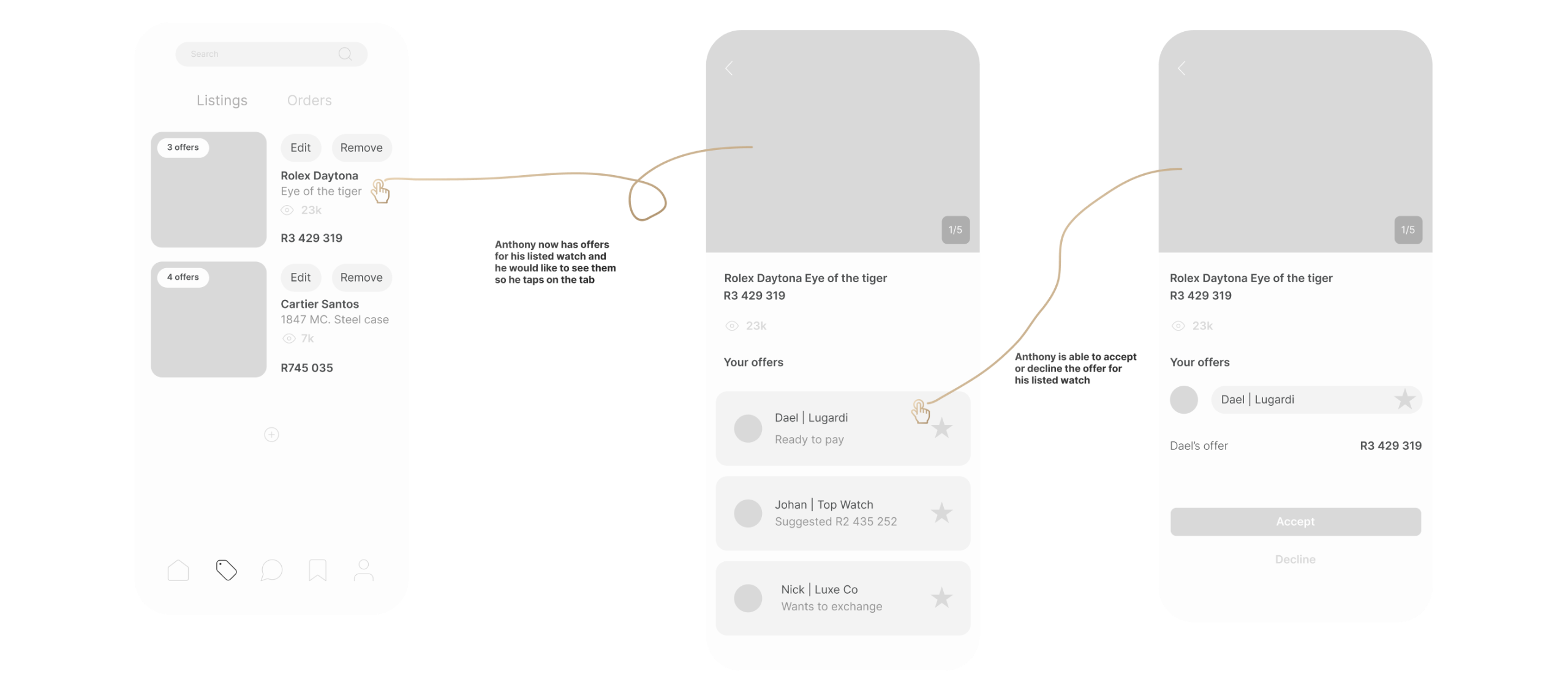
sketching the path Anthony might take based on the research made on his archetype.
the user flow

final execution
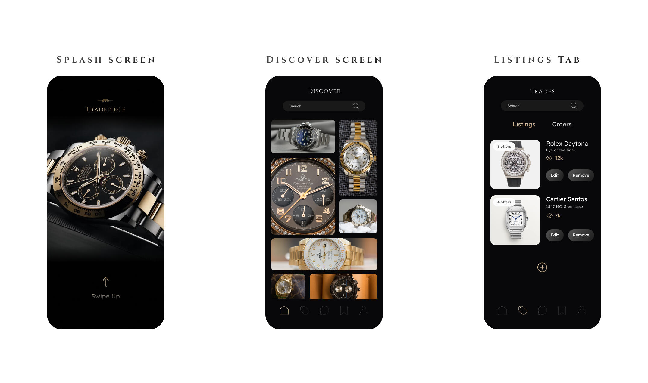

interactive prototype
Let's put all of that research and user testing to work.
point your camera at me to have a closer look at the app